CLI Logo Development
Logo design can be a long and difficult journey, and this was no exception. We did surveys and focus groups with staff, customers, and the board of directors. Ultimately, the final logo was decided by the CEO and board of directors.
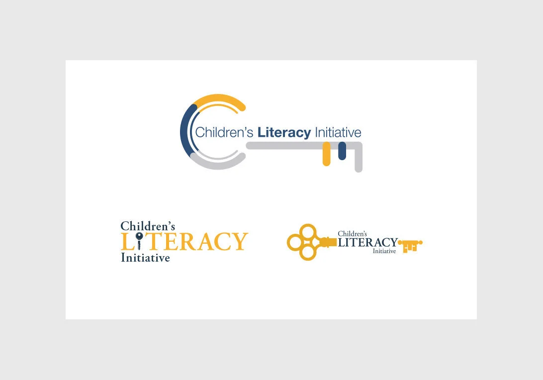
The key to... concept. Literacy is the key to success, life, graduation, or everything. The top key logo won. The board liked the "key" concept best and went with the clean and modern version of that idea.
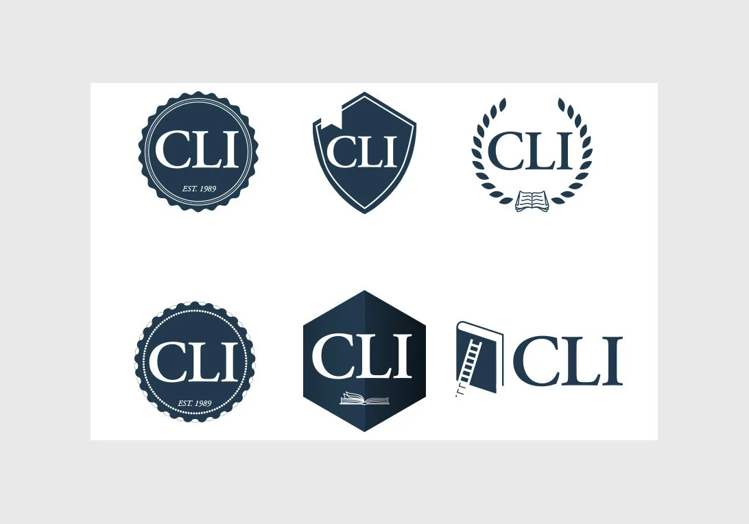
Crest Style Logos - With a switch to the acronym.

Crest style logos - with the defined acronym text.
My favorite logos, unfortunately the board of directors did not select any of these.

Logo idea that included a character that could adapt and change depending on context. These illustrations would later be repurposed for the Reading Equals campaign.

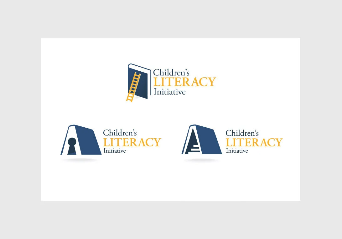
Name with a book and pencil.

Another variation on the book and pencil idea.
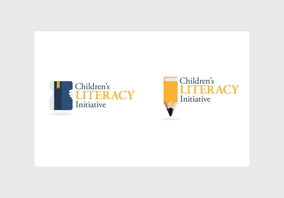
We iterated on the book or book and pencil a lot.